Client
BOOMTV
Category
User Interface & User Experience
Project Duration
3 - 4 Weeks
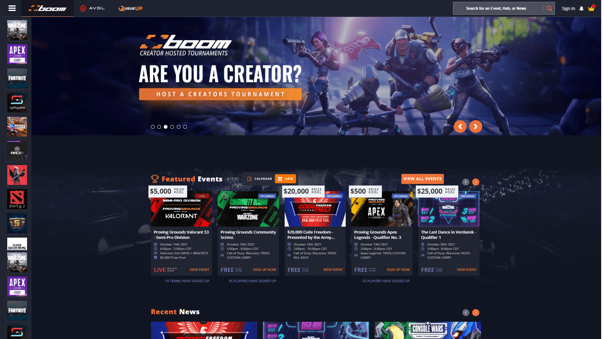
The image below shows the homepage prior to redesign. The bounce rate on this page was unusually high—users often scrolled briefly and then exited without interacting. While some level of drop-off is expected on a homepage, we believed the elevated rate was due to unclear interactive elements, an overemphasis on secondary information, and an overwhelming menu structure.
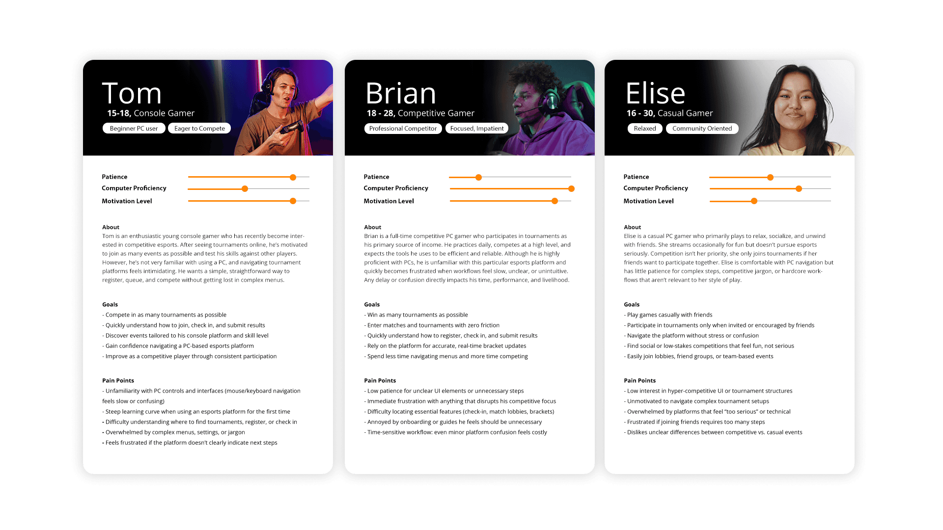
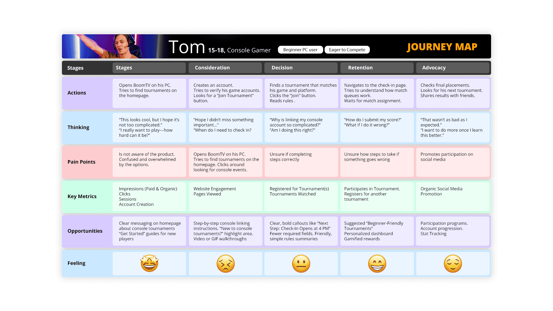
To better understand BoomTV's diverse user base, I developed user personas, journey maps, and surveys to identify user goals, behaviors, and pain points throughout the tournament experience. This research helped uncover areas of friction, validate design decisions, and ensure the platform effectively served both casual and competitive players. The insights gathered informed a more intuitive, user-centered experience focused on improving navigation, onboarding, and tournament participation.
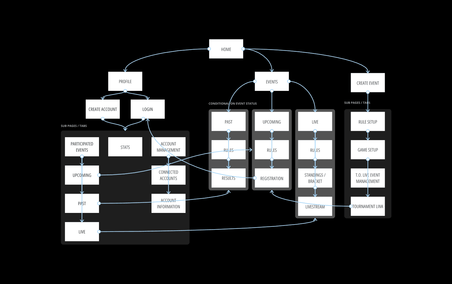
The site map and wireframes were created to establish a clear information architecture and define the overall user experience before visual design began. By organizing content, navigation, and user flows early in the process, we were able to identify potential usability issues, streamline key actions, and ensure users could easily find and interact with the platform's core features. These foundational tools helped align design decisions with user needs and business goals before moving into high-fidelity designs.
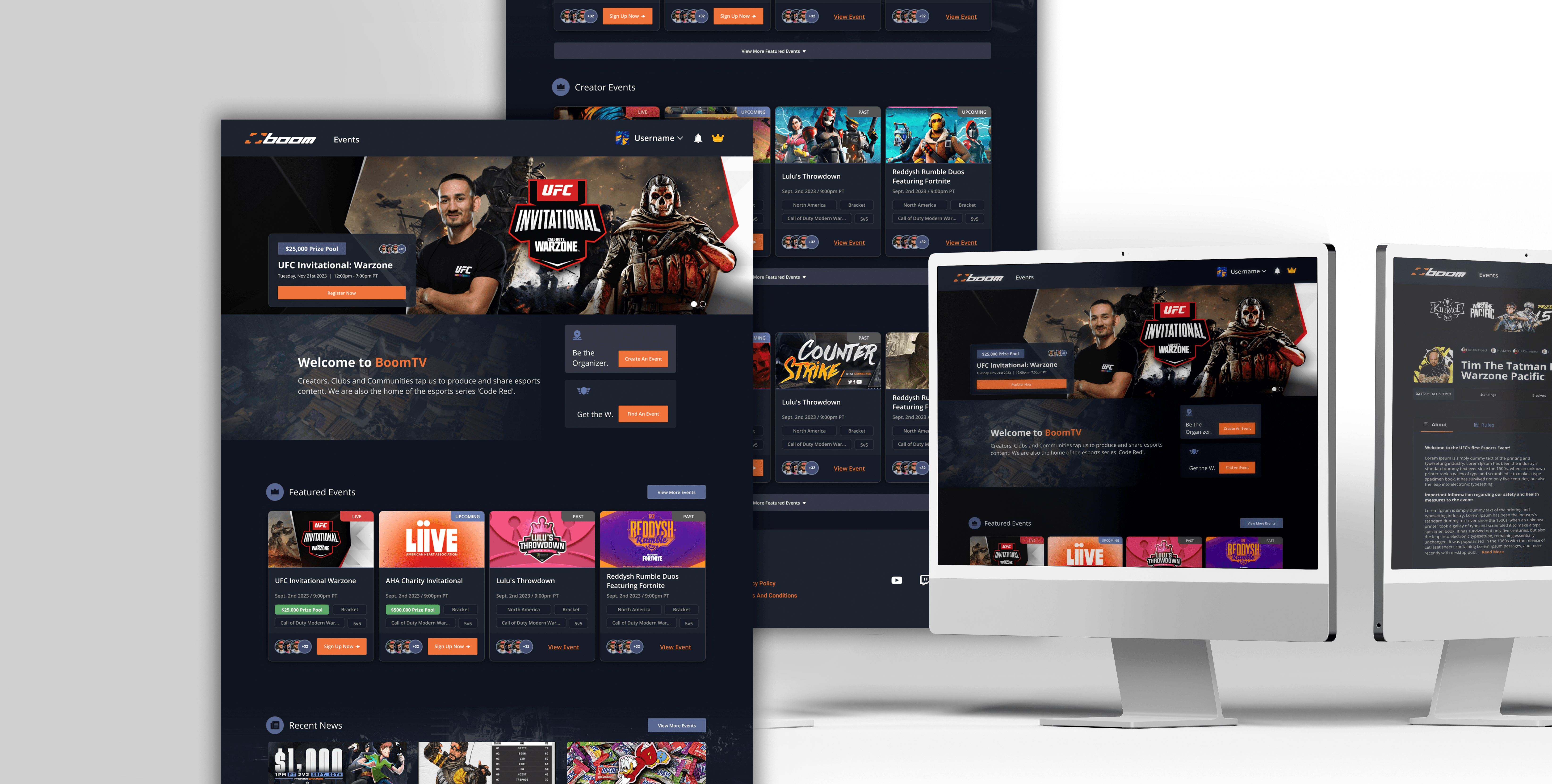
The prototype below showcases the redesigned BoomTV experience, incorporating insights gathered from user personas, surveys, journey maps, site mapping, and wireframing exercises. These research and planning phases helped identify user pain points, refine navigation, and streamline key tournament workflows. The resulting design delivers a more intuitive, user-centered experience that improves onboarding, tournament discovery, and overall platform usability.